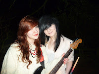
I had many pictures to choose out of so I had to choose the best ones to include within the magazine.
I narrowed it down to these images as I thought it would be better if both of the band members were in the photograph.
In the end I used three out of the four of these images as it made the page more interesting to look at and this would encourage people to want to read it.
 Here is the background that I created by using the 3 pictures and a black box. It is going to be the base of the double page spread.
 Here is the background that I created by using the 3 pictures and a black box. It is going to be the base of the double page spread.
Also I added the band's name at the top in big bold writing so that it stood out, and it was clear to the reader who this double page spread would be about.
I then added text and a lure to the page.
I thought that the writing was a little bit too big so I change the size and added more questions to page making it look like your getting more for your money.
This then finished my double page spread.


No comments:
Post a Comment